
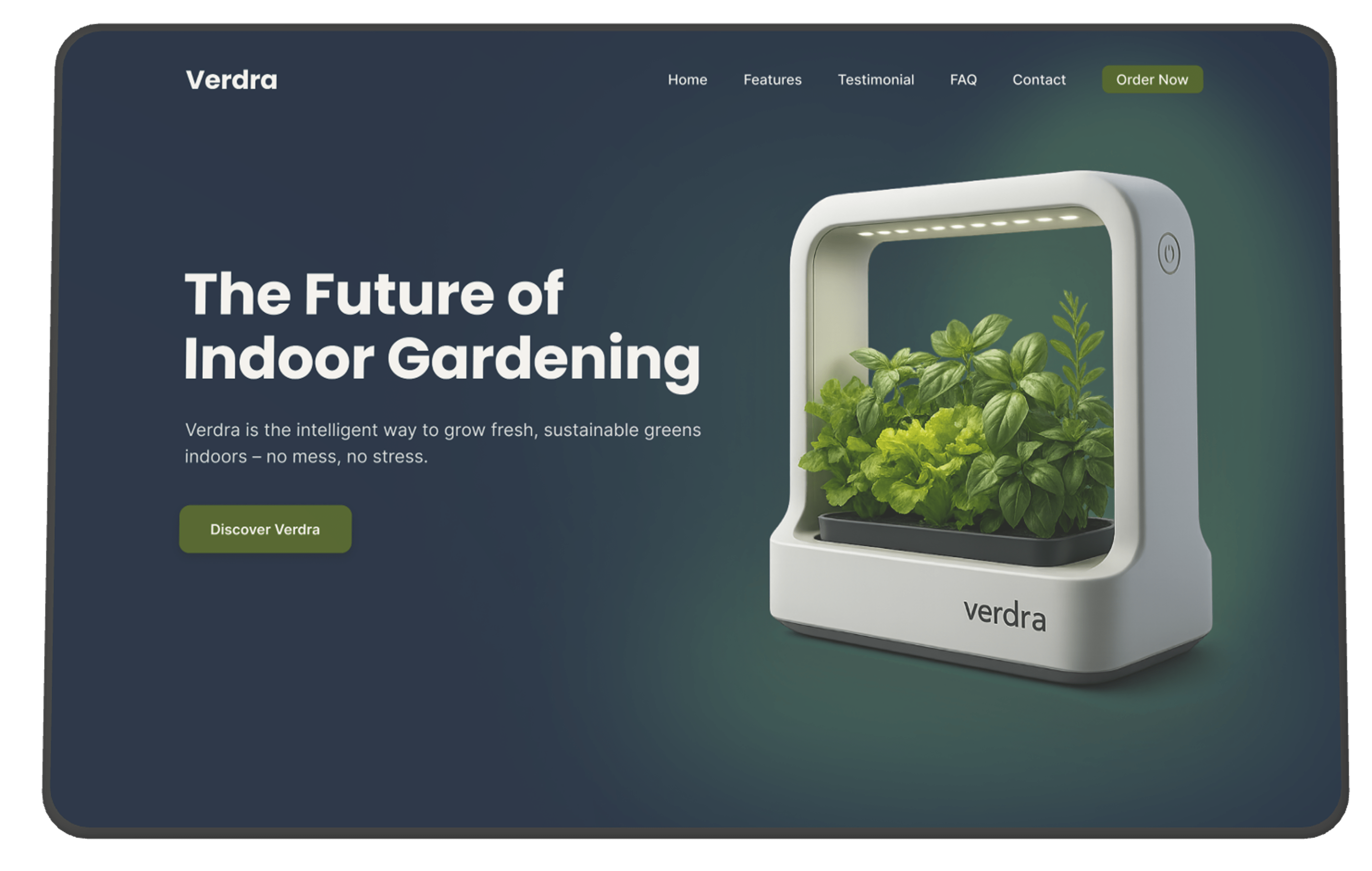
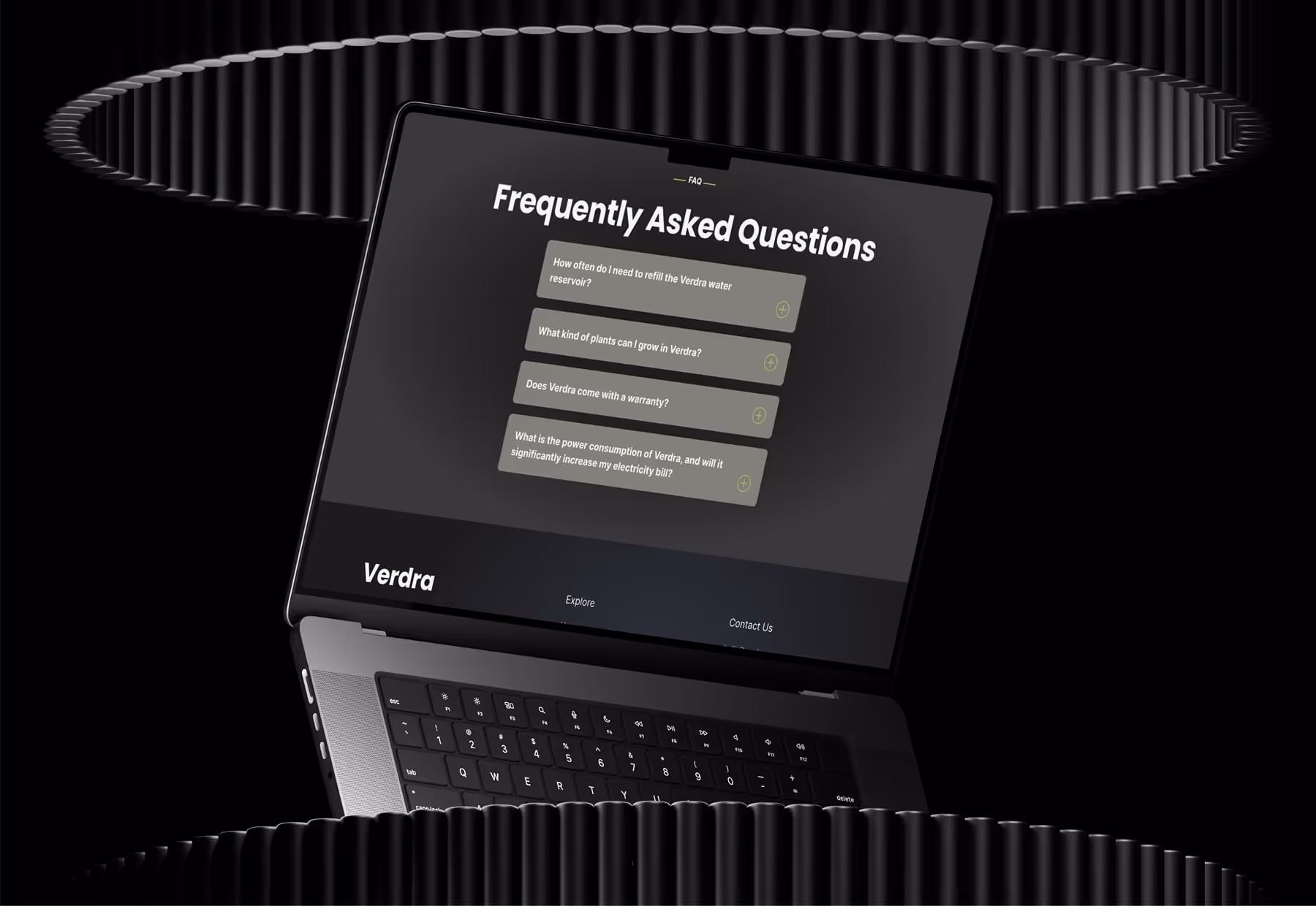
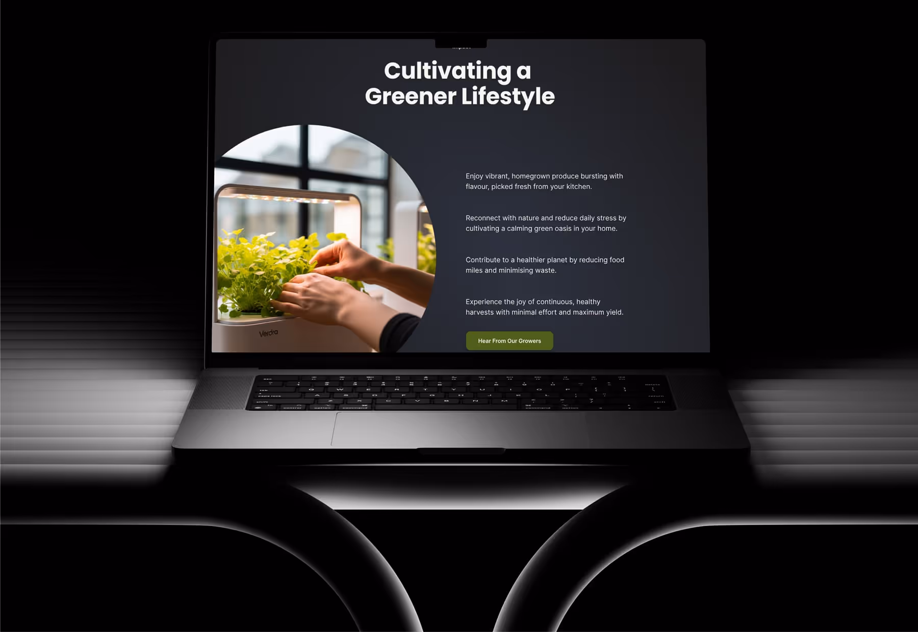
This was my first time building one of my own UI/UX concepts in Webflow. I wanted to see if I could bring my Verdra homepage design to life exactly as I imagined it in Figma — with smooth scrolling, section transitions, and a strong visual rhythm. It was a great chance to focus on scroll-based storytelling, and I really enjoyed working out the flow from top to bottom. I kept the structure lightweight and built each section clearly and cleanly so everything would adapt well across breakpoints.
One of the challenges was figuring out how to time each scroll animation so it felt natural and not distracting. I played around a lot with the delay and ease settings in Webflow’s animation panel to get that right. I also had to work out the best way to structure the layout so it would stay responsive without breaking the design — especially when switching from grid to stacked layouts on tablet and mobile.
Another small challenge was the performance side of things. I didn’t want to overload the page with too many animations, so I made sure to test as I went and simplify any effects that weren’t needed. That helped keep the page light and fast.
Building Verdra gave me more confidence with scroll-based animation in Webflow. I learned how to control section-by-section timing and how to make sure everything still works smoothly across all screen sizes. It also reminded me how important it is to keep the DOM clean — especially with interactions layered on top. This project really helped me understand how to translate design decisions from Figma into Webflow in a way that feels intentional and well-paced.
© 2025 Hexorra. All rights reserved.

