
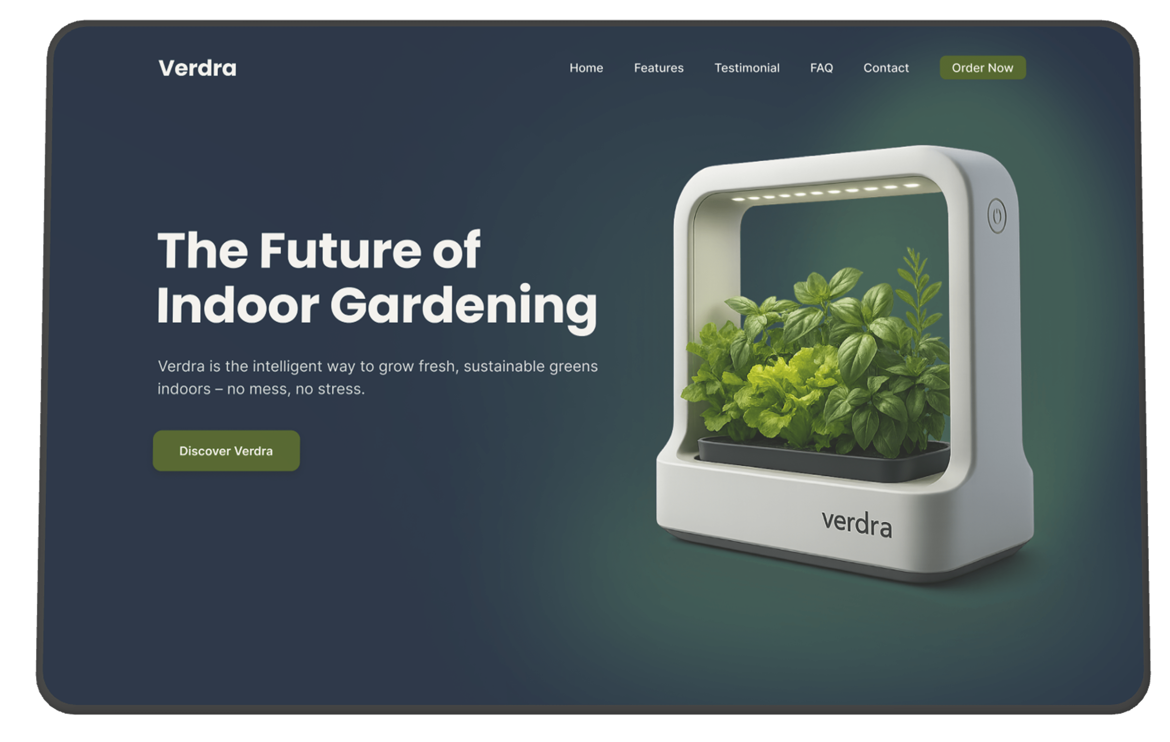
Verdra is a concept project where I challenged myself to design a modern and intuitive website for a smart indoor gardening product. My goal was to create a digital experience that felt clean and inspiring, but still practical for users with different levels of experience — from total beginners to more confident plant lovers.
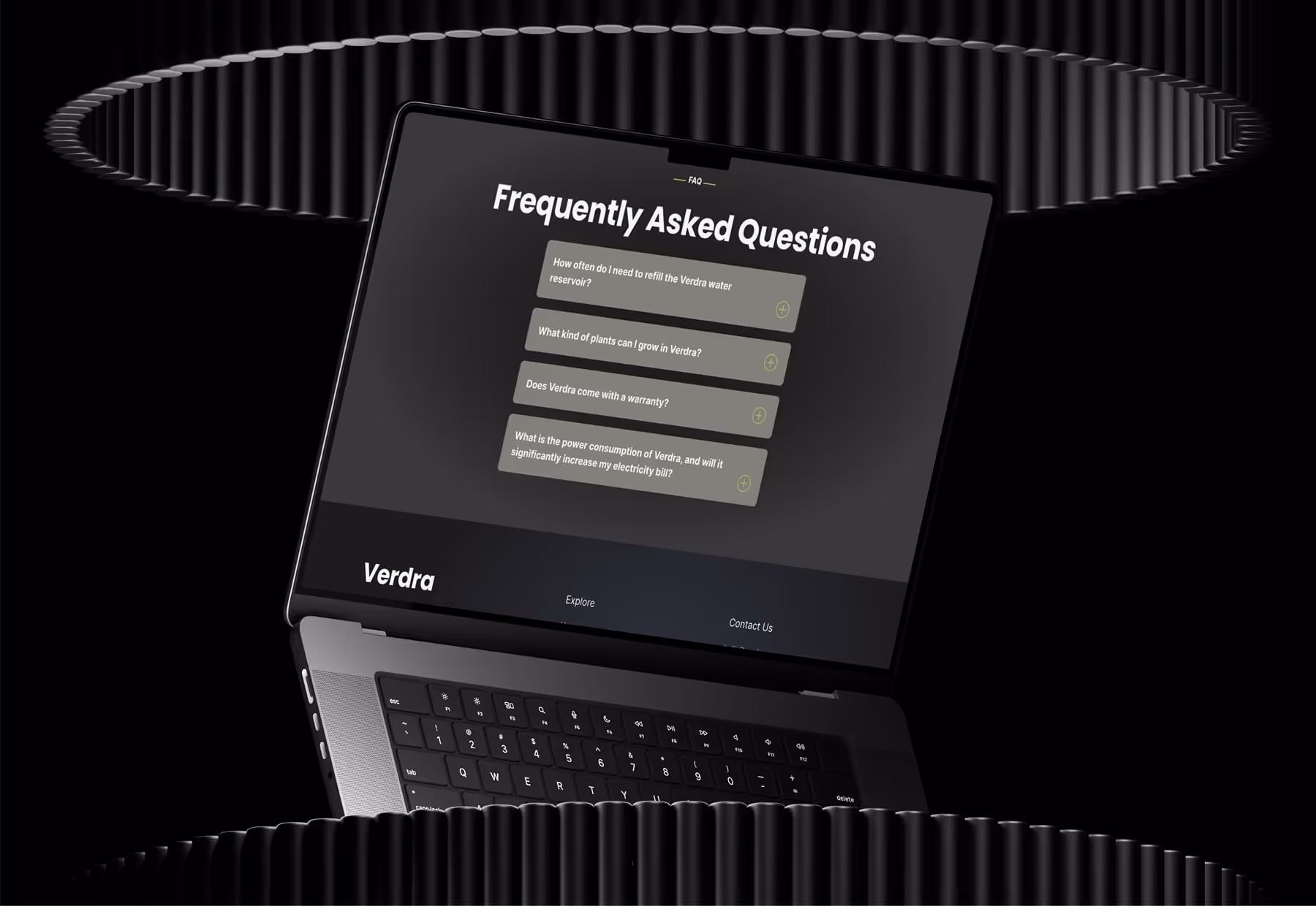
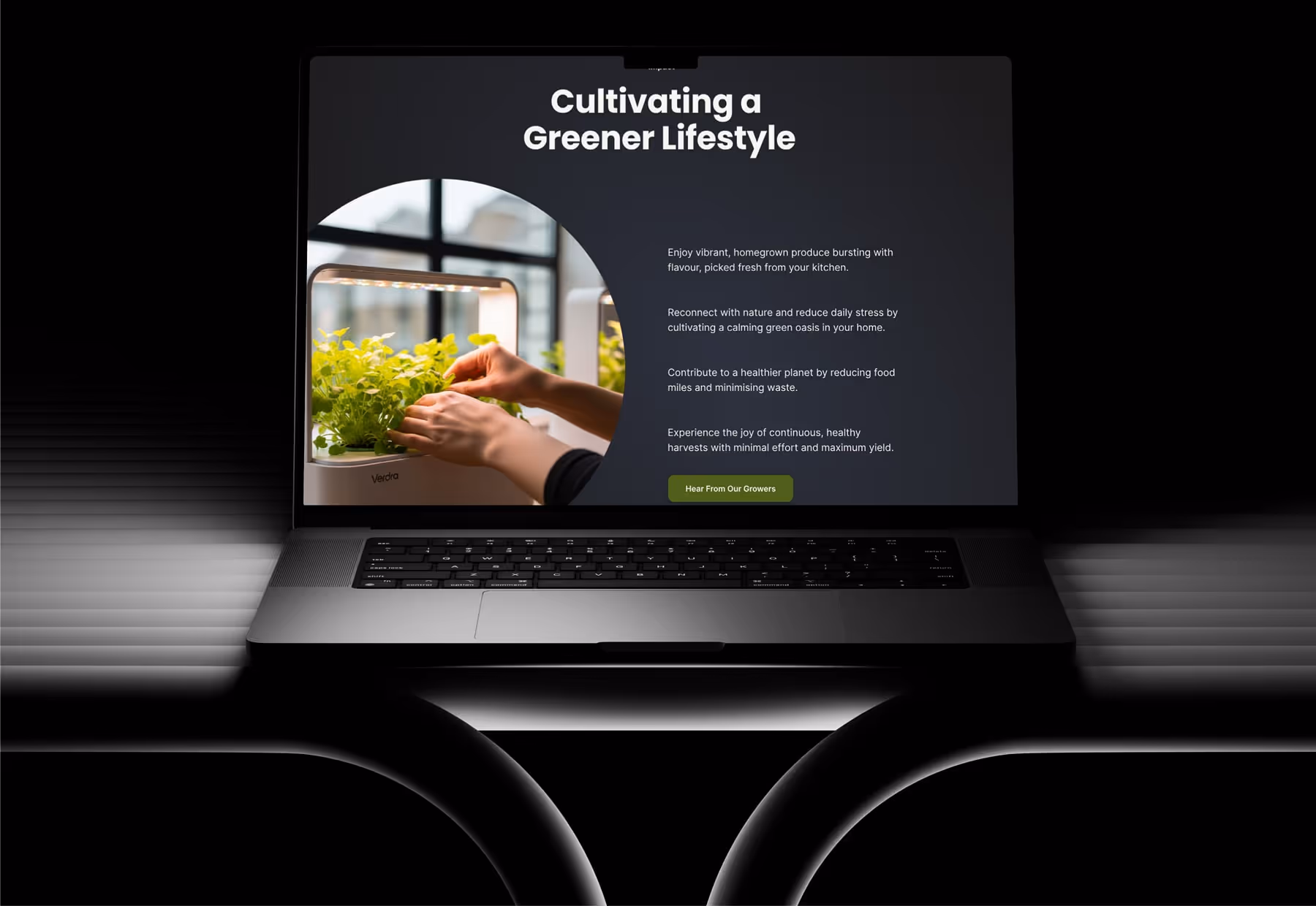
The product includes smart features like automated watering, app syncing, and custom lighting. I didn’t try to overexplain these with animations or technical breakdowns. Instead, I focused on creating a smooth, easy-to-use layout that gives the product space to shine. I added small interactive touches, like a dropdown FAQ section and a testimonial slider, to make the experience feel more engaging without overwhelming the user.
To stay grounded in user needs, I made a few early assumptions before starting the design:
Working on Verdra was a chance to simulate a real-world product design challenge — balancing visual polish with usability and user guidance. Below are some of the key challenges I ran into and how I worked through them:
Because Verdra is a smart product, I had to be careful not to make it feel too technical. At first, I wasn’t sure how much to explain — especially since the website is just a concept and not connected to a real product.
Instead of going into detail or overcomplicating things, I kept the layout clean and let the product speak for itself through short headlines and simple structure. I avoided trying to explain too much and focused on creating a calm and visually consistent experience.
I wanted the overall tone of the website to feel fresh and modern, but still trustworthy and professional. At first, some sections felt too plain, and others were missing hierarchy.
I refined the layout by adjusting spacing, improving alignment, and making sure the headings, body text, and buttons all had enough contrast. These small adjustments helped the site feel more polished and readable, while still keeping the calm, minimalist tone I was going for.
This was my first solo UI/UX project, so I wanted to try out small interactive elements that made the experience more engaging without being too complex.
I added a dropdown interaction to the FAQ section and a simple sliding component for the testimonials. These gave the site a bit of movement and helped users interact with the content in a natural way.
Although this was a solo project, I approached it with the same structure I’d use in a team environment — including clear goals, organised UI thinking, and usability consideration throughout.
To help guide the visual tone, I started with a moodboard based on brand values like nature, balance, and modern tech. I documented my structure and notes in Notion, then designed and prototyped the full experience in Figma.
Before finalising the design, I did informal usability testing by sharing the prototype with friends and family — some tech-savvy, others not. Their feedback helped me make important refinements: from clearer button labels to better content pacing. This lightweight testing gave me confidence that the experience would feel intuitive to a wider audience.
© 2025 Hexorra. All rights reserved.

