Dublin R+B App – UI/UX Case Study

Solo concept project – UX research, UI design & prototyping

My Role

Lead UI/UX Designer, User Researcher, Prototyper

Team

Solo Project (Concept)

Tools Used

Figma (UI & Prototyping), Notion (Documentation)

1. Project Overview

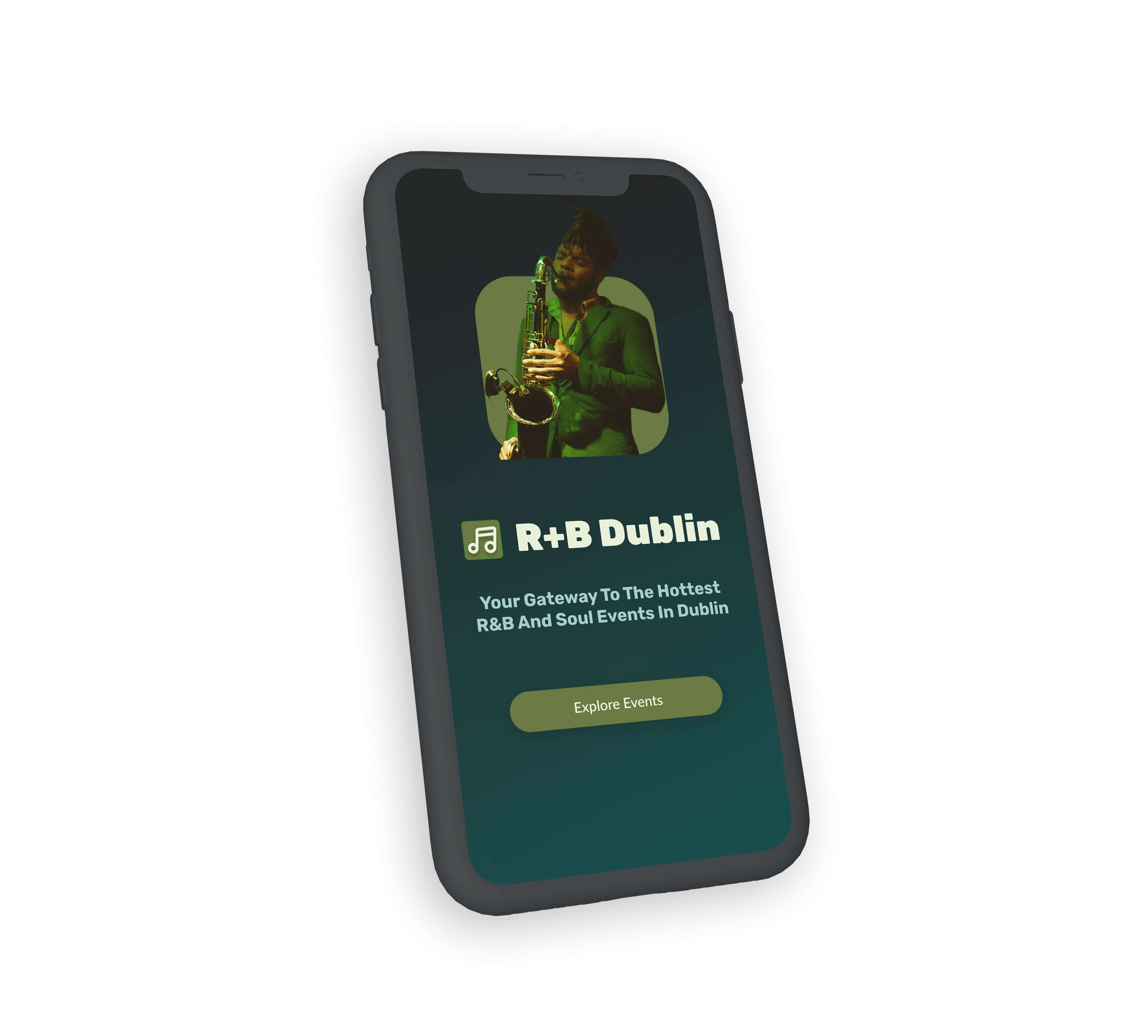
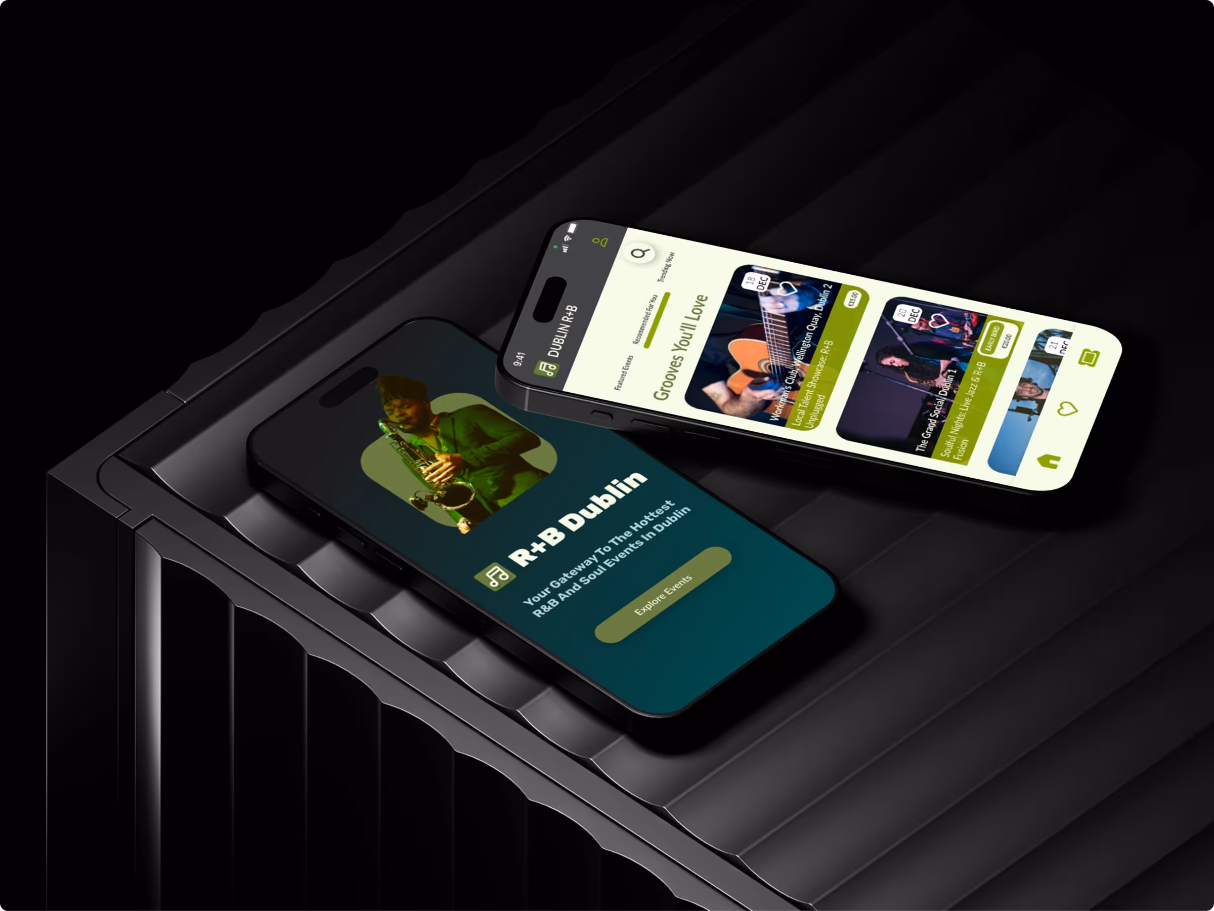
Dublin’s R+B scene is vibrant but scattered. I created this mobile app concept to bring all R+B lovers together in one place — from upcoming events to small DJ sets and local club nights.

This project started as a passion idea: I love this genre, but I found it hard to find reliable info in one place. So I designed a mobile app that would help users discover upcoming events, view event details, and easily book tickets.

2. Goal

To design a clear and exciting user experience for people who love R+B and want to stay in the loop about gigs and events in Dublin.

I wanted the app to feel energetic, but also easy to use — a go-to place for browsing, saving and booking events.

3. My Role

To design a clear and exciting user experience for people who love R+B and want to stay in the loop about gigs and events in Dublin.

I wanted the app to feel energetic, but also easy to use — a go-to place for browsing, saving and booking events.

4. Challenges

  • Designing a booking experience that felt smooth on mobile
  • Making the homepage exciting without overwhelming users
  • Keeping event discovery simple and quick to use

5. Key Design Features

  • A rich and inviting visual style, blending deep greens and teals, creating an immersive R&B vibe
  • A homepage with featured events and smooth scroll interactions
  • Intuitive event discovery powered by a prominent search bar, allowing users to quickly find events by artist, venue, or keywords
  • Clean event detail pages with strong visual hierarchy
  • A wishlist feature for saving events
  • A simple booking flow with confirmation page

I also created an interactive prototype that allowed users to click through the flow — including the homepage, event listing, event details, and booking confirmation.

Visual Showcase

6. Outcome

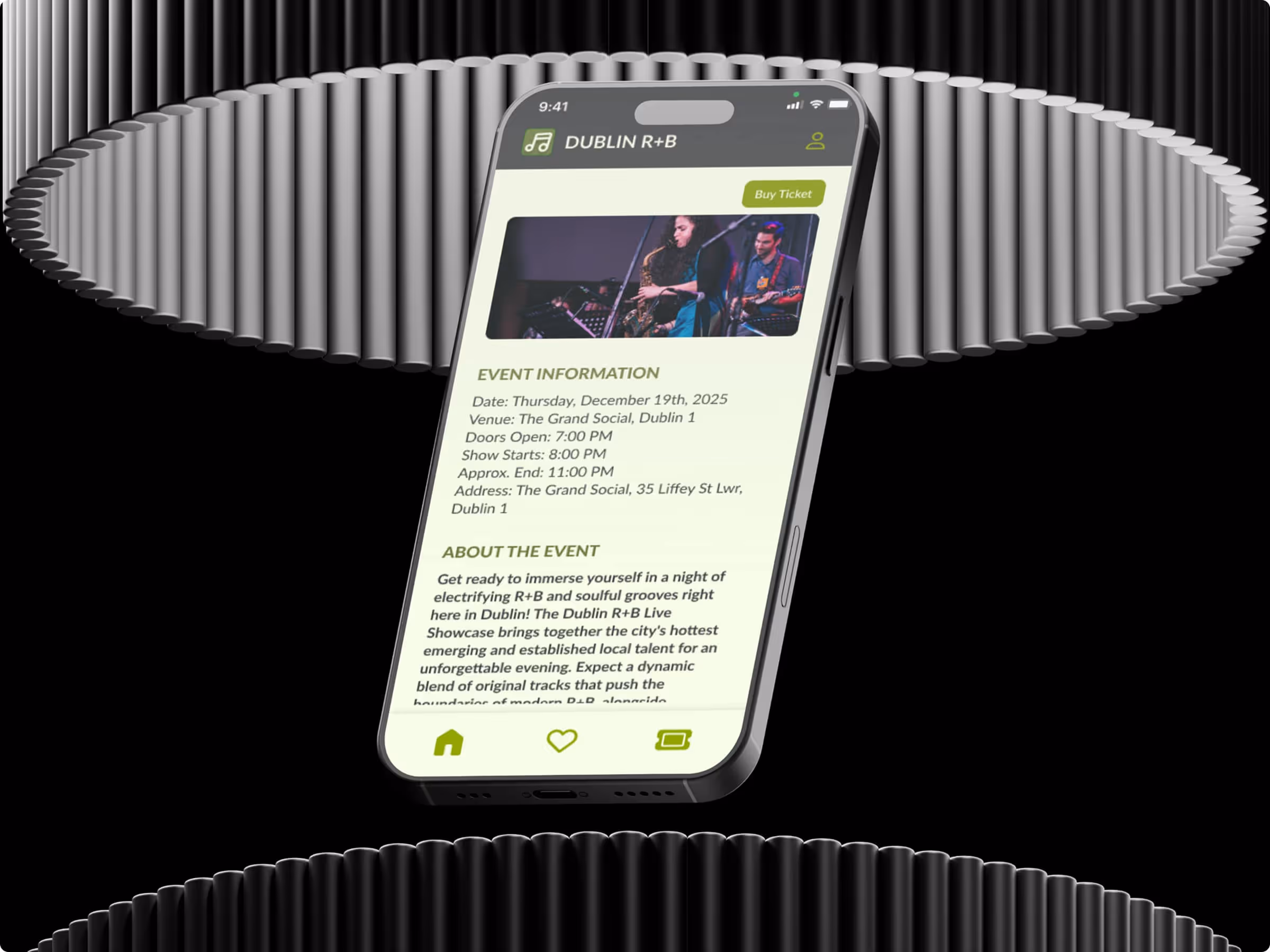
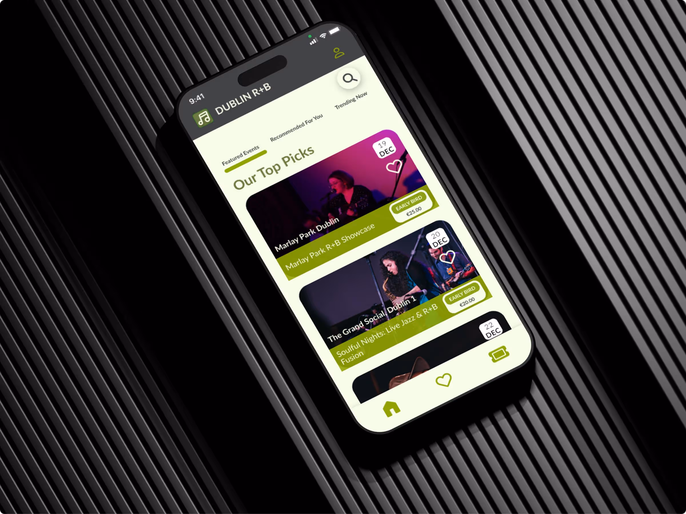
This concept helped me explore mobile design in more depth, especially how to create a smooth experience for a music-based app. It also pushed me to consider how to structure information so users don’t feel lost or overwhelmed.

Testing the prototype with friends gave me helpful insights into what worked and what didn’t. Based on their feedback, I adjusted things like spacing, font sizes, and button labels.

7. What I'd Do Next

If I were to take this project further, I’d:

  • Expand the prototype to include user login and payment flow
  • Explore a calendar-based event view
  • Use tools like Maze for deeper usability testing
  • Test the design on different screen sizes and devices

6. Key Takeaways

  • Design should tell a story, not just list features — especially for innovative products.
  • Visual hierarchy matters as much as layout — spacing, contrast, and pacing drive user trust.
  • Even solo projects can use structured feedback — informal testing gave me real insight into user reactions.
  • Documentation tools matter — Notion helped me stay organised, while moodboarding helped me stay visually consistent from start to finish.

7. Credits and Attribution

  • This design utilises elements from the "iOS 16 Status Bar" UI Kit by Wayne Dahlberg, available on Figma Community, and is licensed under a Creative Commons Attribution 4.0 International License (CC BY 4.0). For full details, refer to the original material iOS 16 Status Bar – Figma

Experience the Prototype

Dive deeper into the interactive experience of the Dublin R+B App.
View Figma Prototype